
Helio Health
B2C , Healthcare
Advertising // Branding // Content // Design // Digital // Research
Syracuse Behavioral Healthcare (SBH), a healthcare provider focused on supporting mental health and substance use disorders, had outgrown its brand in three main ways:
With these out-of-date brand dilemmas in mind, and a national spotlight on the opioid crisis, Syracuse Behavioral Healthcare hired us for rebranding that would shine a brighter light on its services and solutions.
Those suffering from a substance use or mental health disorder need a resource that “gets it.” Someone who truly understands what patients and family members are going through, and who cares deeply about transforming lives. To us, there’s nothing that says, “I get you” about the name “Syracuse Behavioral Healthcare” when you’re a patient with a substance use disorder and are located outside of Syracuse, N.Y.
So, we got to work. We started the brand transformation by renaming the organization.
The sun represents so much—warmth, hope, rising, awakening, a new day, power and growth, to name a few. The sun perfectly symbolizes the client’s mission to be a bright spot in the dark landscape of substance use and mental health disorders. We took this big ball of fire and tracked it back to its Greek-mythology roots to find the word “helio” (sun) and created “Helio Health,” along with the new tagline, “Where hope meets healing.”
Now that we had the name and tagline, we couldn’t keep them tied to a design that was dark and dusty. So we cleared the dreary clouds with a whole new design and color palette that let the sun shine through.
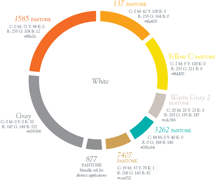
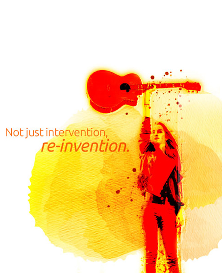
After locking in the logo, it was time to focus on the look. Mental illnesses aren’t black and white. They have different layers, stages, relapses and success stories, which we wanted to leverage to connect with patients, family and friends. So we took watercolor layers and overlapped them in all shapes and shades. Paired with real human photography underneath, we communicate that a breakthrough is waiting beyond the bright bursts of orange and yellow.
From billboards to digital banners, these campaign visuals are open to interpretation, while remaining grounded in striking representations of transformation. Sure, it’s an eye-opening departure from typical healthcare branding, but at the same time it lands way closer to the consumer—the whole point.
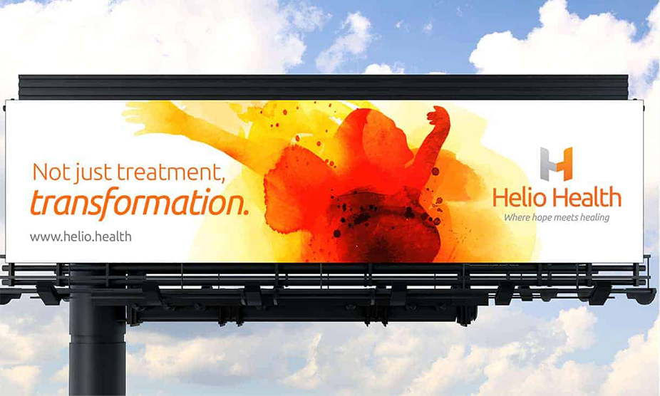
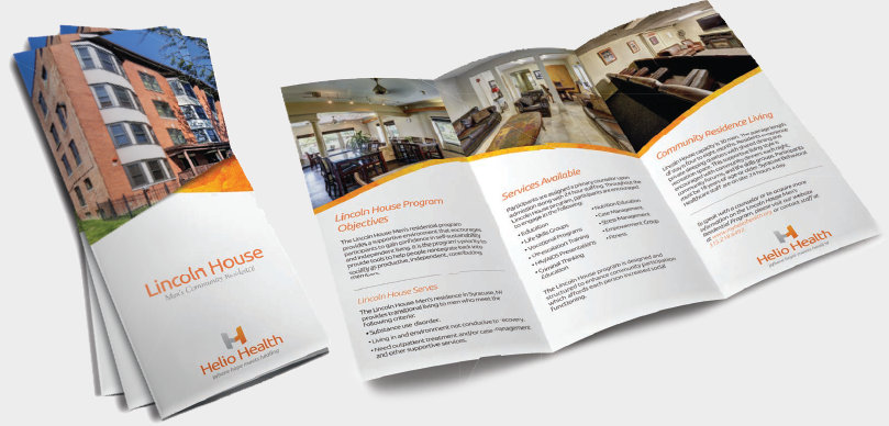
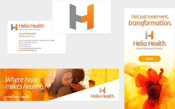
With a new name/logo/tagline, website, advertising, collateral, video and public relations, Mower gave Helio Health the foundation to grow its lifesaving and life-transforming mission by communicating that Helio Health is here to help with personal transformations, no matter what stage of the journey someone is on.
By creating a fresh name, color palette and content, we helped Helio Health stand out in the healthcare industry, while closely connecting to patients in a way that says, “we get you” and “we got you”—leading more patients to believe Helio Health cares about them.
Key Brand as Friend® drivers:
Hey! Our name is pronounced Mōw-rrr, like this thing I’m pushing.