
Explore and More
B2C , Non-Profit , Travel & Tourism
Advertising // Branding // Content // Data & Analytics // Design // Digital // Public Relations // Social Media // Strategy & Planning
Explore and More—a nonprofit interactive children’s museum filled with sensory play and hands-on education for ages zero to 12—had just purchased a new space, moving them from the suburbs to Buffalo’s buzzing waterfront. With this move, the museum wanted a fresh new look that matched their new four-floor location. They also wanted to diversify their branding to go beyond the traditional nuclear family and stagnant museum image, and they hired us to make it happen. Luckily at Mower, we have a “work hard, play harder” mentality—making this pro bono project a dream for our team.
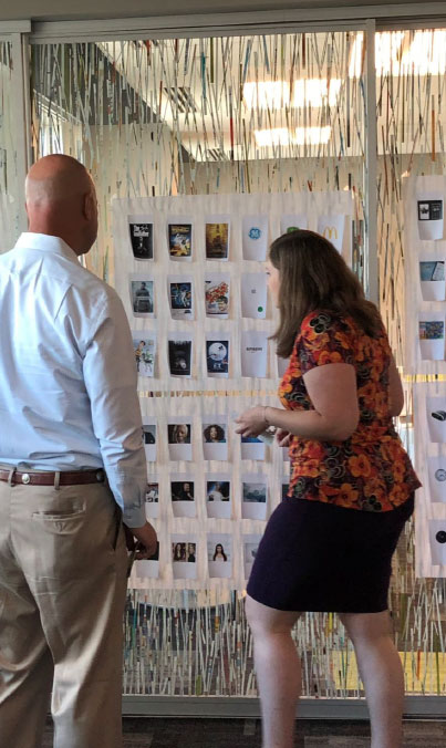
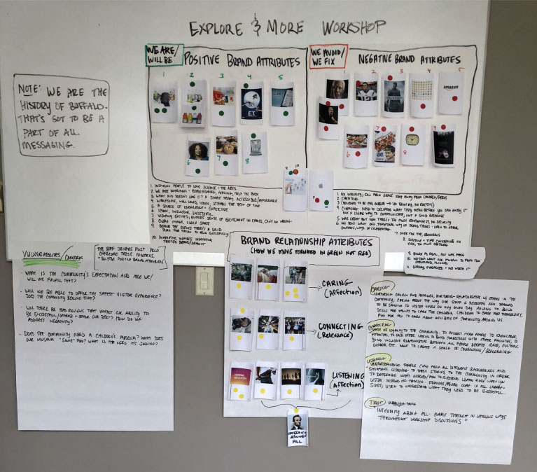
We started by taking the Explore and More team through our proprietary Success Plan process, which included an interactive workshop that got their team and ours aligned with the museum’s goals for the project. Their team identified that they wanted to get 52,000 visits between June 2019 and April 2020. They viewed caring (going above the bottom line), connecting (building community) and listening (taking care of customers) as their top three Brand as Friend® drivers for the project. But above all, the museum wanted to propel their status from “rainy day plan” to an experience that empowers children and becomes a hub for community growth.
Explore and More wanted to give their visitors the same adrenaline rush you get from going down a slide or the a-hah moment when you finally learn something new. So we began by brightening up their logo—making the colors pop, picking a more playful font and enlisting an illustrator to watercolor the sun. To follow up, we had the same local illustrator create a series of watercolor icons to serve as navigation devices on the website refresh and eventual on-site signage.

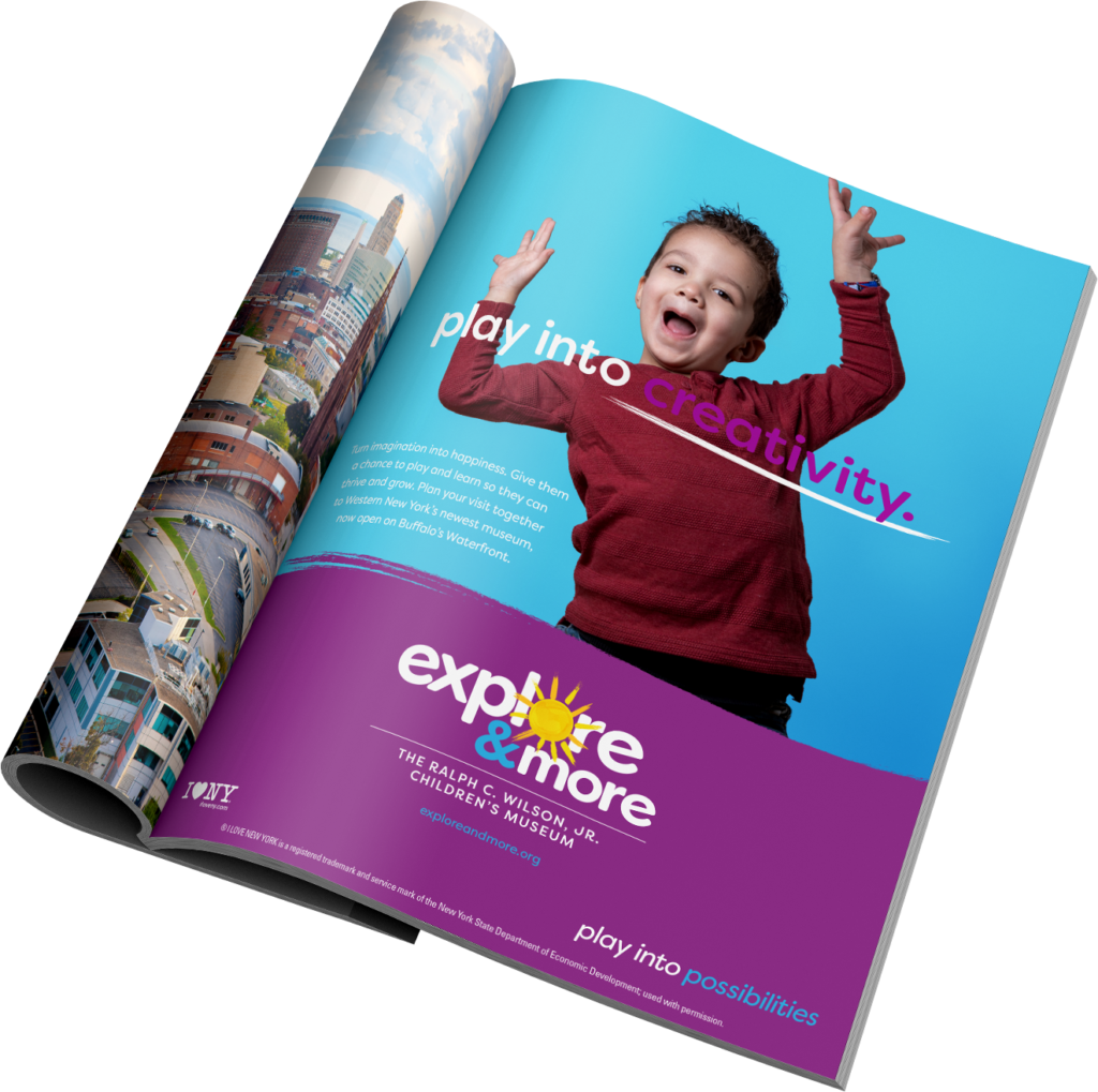
One of our favorite parts of this project was the photo shoot we held featuring kids, well… simply being kids. And we supported our new tagline—“Play into possibilities.”—with messaging that invited people of all ages to do just that.
With the creative done, it was time to put our work into play. We rolled out a website, TV and radio scripts, outdoor billboards, print ads and social media that were full of colors, human expression and inspirational lines. We also created an inspirational and robust style guide for continuity down the line.
To get the word out, we coordinated a dedication ceremony with the New York state governor, scored a spot on a local public television station, WNED, and managed their upcoming fundraising campaign with videos and influencers. At launch, we counted 90+ pieces of coverage between news stations, online editorials and social posts by local influencers, and coverage by the Associated Press, which was picked up by 10 outlets, including Long Island’s Newsday and U.S. News & World Report.

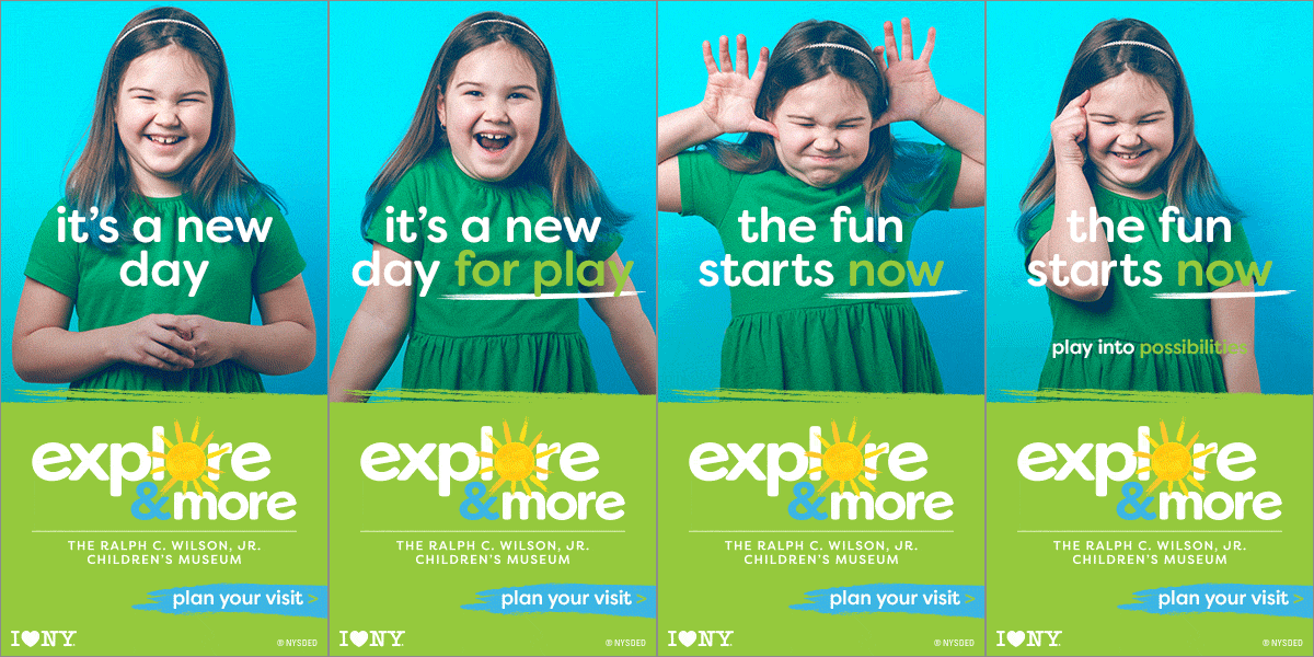


As soon as this campaign hit the market, it was a success. As mentioned, Explore and More’s goal was to get 52,000 visits between June 2019 and April 2020. With the pandemic, the timeline may have been cut short to March, but the results weren’t. Explore and More served 168,260 in-person guests. And the diversity goal? We’re proud to report those visitors came from 2,702 ZIP codes.
Online? We recorded 153,940 sessions with 82,580 being new users. According to the Google Analytics benchmarking report, Explore and More’s paid search website traffic was 835.62% higher than the average for other local museums. But hey, that’s just what friendship is all about. Because friends make sure friends are exposed to inspirational and “a-hah” moments, every single day.

When our client moved its interactive children’s museum from the suburbs to the city, they took it as an opportunity to roll out a more inclusive brand that connected with a wider audience. After listening and learning about their new audience, they launched messaging that portrayed families of all kinds and children of all ages, races and abilities. With rich PR efforts and outreach across multiple platforms, they expressed care by ensuring they were becoming a hub for community growth. With bright new colors, designs messaging and genuine invitation to play, they began to truly feel like a child’s friend. And hey, aren’t they? We think so.
Key Brand as Friend® drivers:
Hey! Our name is pronounced Mōw-rrr, like this thing I’m pushing.